Creating a progress bar using CSS and a bit of jQuery
Some call it a "loading bar"... it "cannot" be made due to some of Javascript's deficiencies with image objects, therefore the most common substitute for it is an animated .gif. With a bit of experimentation and improvisation I've created a progress that loads every image individually. This is how it all went down...
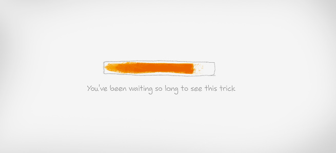
When we've created BokicaBo's "Hello Nature" website, I always had a lurking idea about how a linearly loaded image can actually show which percentage of the image is loaded if we implement a simple scale, Demo 1. Hehe, wow :) Impressive, but this is how the whole idea came about:
Bear in mind that the most important thing about linear image loading is that while saving .jpg images you have to turn off the "progressive" option because it loads multiple .jpg's (scans) offering you to choose the baseline option. Check out the difference in Demo 2.
All images in the Demo pages are not "cached" unless someone wishes to see the demo multiple in order not to empty the cache. The are "not cached", although technically they are as I've added a dynamic number (image.jpg?12112121) next to every image which in this ??? I used php
time()function.
CSS3 Rotation (made my day happy)
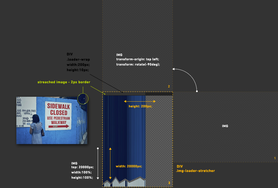
The next step was rotating the image using the CSS in such a way, allowing linear loading of the image from left to right transform: rotate (-90deg); while the proportion transform-origin: top left; for the center rotation. With a few CSS lines of code I manage to pack an image in a DIV container and simulated the loader. Previously I created a right border 10px thick in order to hide it using CSS later. Take a look at Demo 3 in order to see what I mean. Detailed information can be found in the source code.
Since we've managed to cache the image, we can manipulate the latter and, for example, fade the image in. You might have noticed the yellow border - or the loader bar, respectively. It's a bit unaesthetic if the image opens outside the browser page where you can see this yellow border. Since our options are limited, these things can be minimized by creating a 1-2px border and "extend the pixels". One of the effects is a small distortion of pixels and colors. The image below shows how this functions, and you can check out an example in the gallery below.
Making the gallery
The image is cached and we can manipulate it. In order for this loading effect to be perceptible, I used large images. This lead me to creating a "multi-resolution gallery" and I think I haven’t see anything similar before. It’s interesting to point out that this functions on all monitor resolutions, and it works great on both the iPhone and iPad devices. I have created 3 similar galleries, and to preview how this works. For the iPhone and the iPad (as well as other devices), you can directly access them on the following short URLs:
- First gallery, all images are loaded simultaneously, Demo 4, short: bergb.co/g1
- Second gallery, all images are loaded consecutively using AJAX requests, Demo 5, short: bergb.co/ig2
- Third gallery, images are loaded consecutively using infinite scroll and AJAX requests, note: for mobile devices, I made a simple trigger, "pull up to update" because iOS Safari doesn't correctly calculate the difference between scrolling and the document's height Demo 6, short: bergb.co/g3
The gallery has been tested on: IE7, IE8, Opera 10, Safari 5, Chrome 8, Firefox 3.6, iOS (Safari).
Download the source code.
While creating the AJAX galleries, meta data (EXIF) was embedded in the images, namely the Title. Through a php function exif_read_data () the latter were loaded, and in such a way I used the EXIF option bypassing the creation of a string of titles. The simplest way to add this data (Windows) is by right clicking the image > Details > Title (click on the side) or if using Photoshop > File > File Info > Document Title.
Okay, the loading bar is great, but I’d like to point out a few advantages of such galleries:
- A stronger and complete experience of the images derived from the mere image size
- Fast overview of the images, i.e. - the jump from the 1st to the 10th image. Scrolling and sliding in this case appears much more natural than clicking. This reminds me of browsing images on an iPhone or iPad using their native application, although here we have a vertical image overview.
- Adaptability to all monitor resolutions as well as mobile devices that read HTML and CSS.
The weaknesses:
- Image size (if that counts as a weakness, having in mind that that Internet bandwidths are rapidly increasing).
Usability:
These galleries and their method of loading can certainly find usability amongst champions of quality for small galleries and presentations, as well HTML, javascript and CSS enthusiasts.
Conclusion:
Certainly, this post is partially experimental and it was a pleasure to explore and play around with these things. Generally speaking, browsers have a small lag while transforming images, therefore a few blinks/cuts appear every now and then. My previous experiences with image transformation were similar. For example, if you shrink an image by 10% and try to implement some sort of animation, a certain choppiness and blinking appears. Apparently it’s related to the browser. If anyone knows how this can be solved, please feel free to drop me a line or leave a comment... or, if they want they can create a jQuery plugin and email me.
Hungry for more? Follow me on Twitter.
Special thanks to:
Photos: Nico Nuzzaci
Translation: Vasilije Perovic
Post new comment