The Belgrade-based BeRGB agency was orginally founded in 2010 by Nikola Arezina. We’re a small but good looking team that has managed to achieve some great results on the web these past couple of years. We live and breathe design and it’s this passion for creating great things that serves as the driving force behind our studio.
Our objective is to create a simple, clean and unique visual design that is elegantly sophisticated. We therefore have a complete understanding of what it takes to create successful design for business professionals...
Services: Graphic Design, Branding, Web Design (UI, UX),Web development, (Apps, CMS), Mobile Apps (Android, IOS), Web consulting
Wirestar Networks
Wirestar Networks
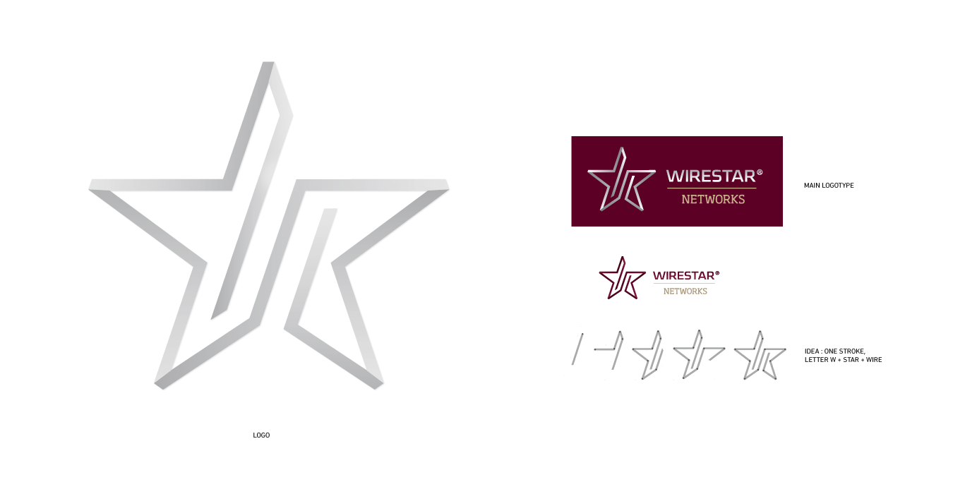
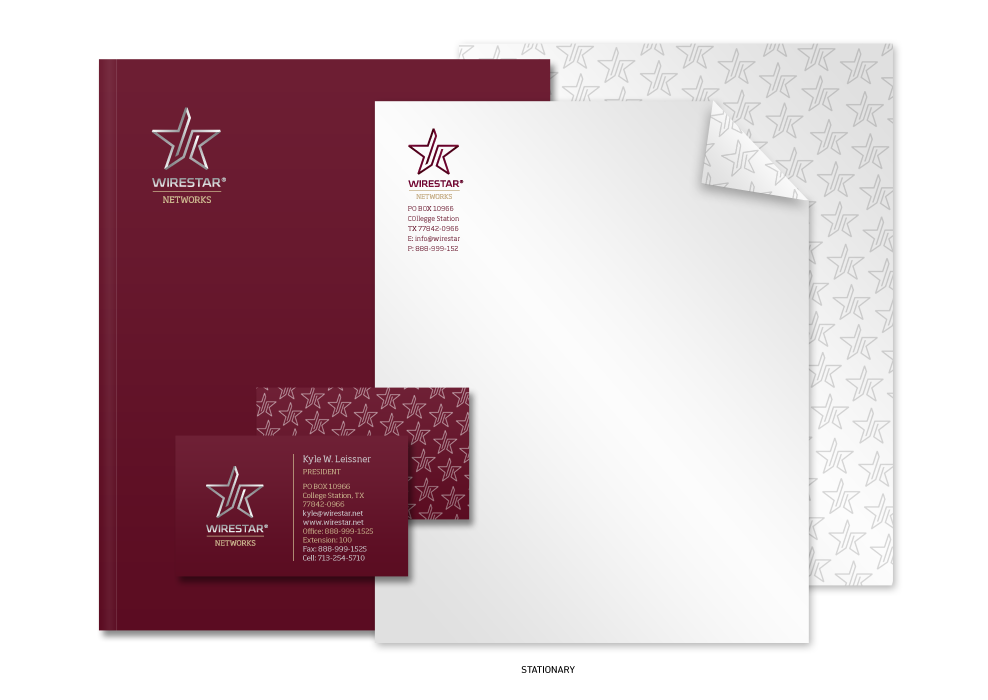
Texas, USA, based internet service provider with main activities in optical fiber networks and High speed Internet. We created visual identity centered on wire symbol as a main building block for other graphical elements making foundation, along with predefined unconventional colors, for fresh brand and web site. Done with Bogdan Maksimovic
Logo
Stationary
Icons
Website Visit

Aabo
Aabo
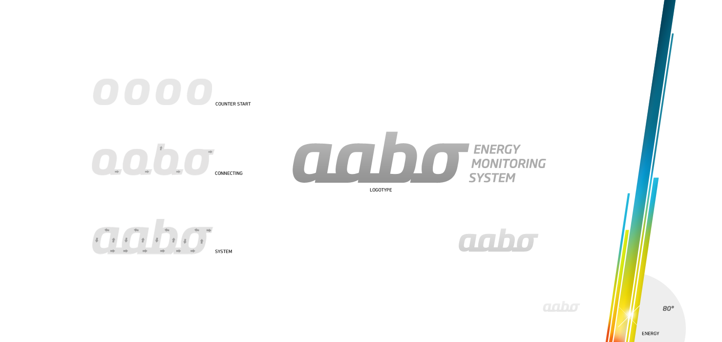
Croatian software and hardware Company providing solutions in the field of electrical power control and monitoring systems. Main objective was establishment of visual identity through creation of user friendly web interface enabling energy consumption estimation. Web interface is based on drag and drop supported control dashboard with widgets.
Logotype
Stationary
Icons
User interface

Cryo Save
Cryo Save
is the biggest stem cell bank in Europe. Along with their representative office in Serbia we have created an illustrated web presentation (Matične ćelije) in order to raise awareness about stem cell storage. The main task consisted of explaining what stem cells are, what methods are used for their collection and how they are stored.
This project was done in collaboration with Vesna Pešić, a Serbian illustrator/designer who also happens to be one of the best in collage works in the region.
Website Visit

Pindone
Pindone
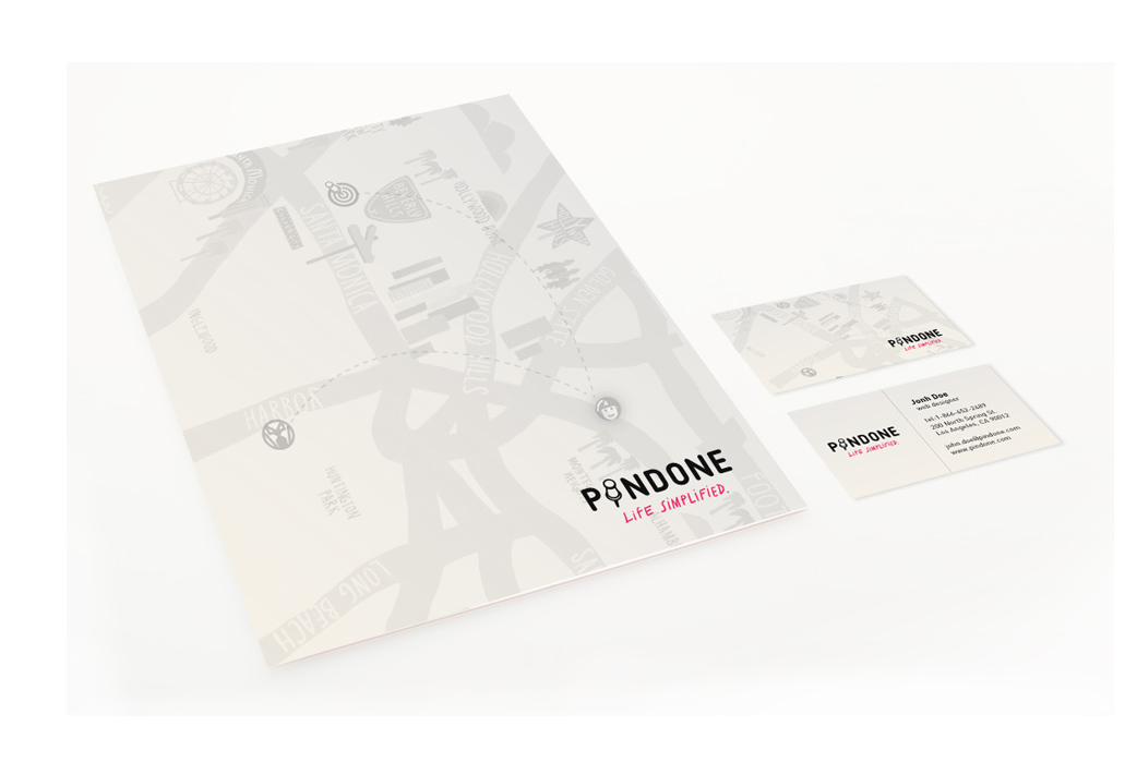
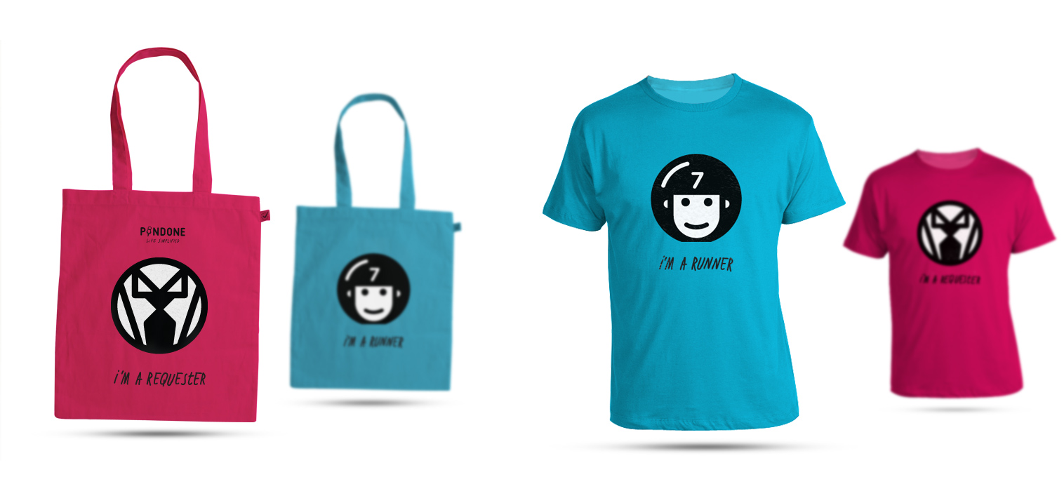
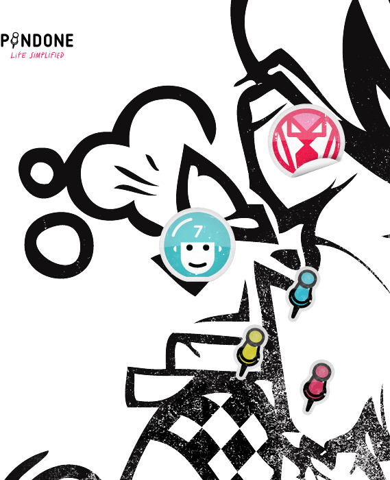
is a is a technology platform for crowdsourcing personal errands and household services on demand. It presents a win-win solution for busy individuals who look for on-demand help and for those who want flexible jobs based in Los Angeles, CA. Our main task consisted of creating a new visual identity which would correlate between requesters and runners, and as such bring them closer to their target groups. This project was performed in collaboration with Verica Sokanovic, a very gifted and experienced designer.
Pindone logo and icons
Stationery
Tote bags and t-shirts
Stickers
Posters

Green Line Networks
Green Line Networks
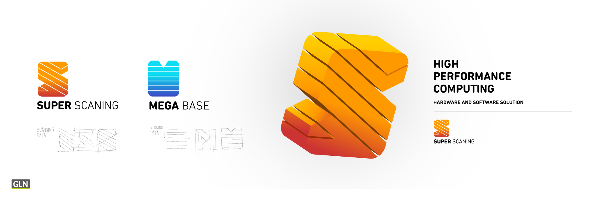
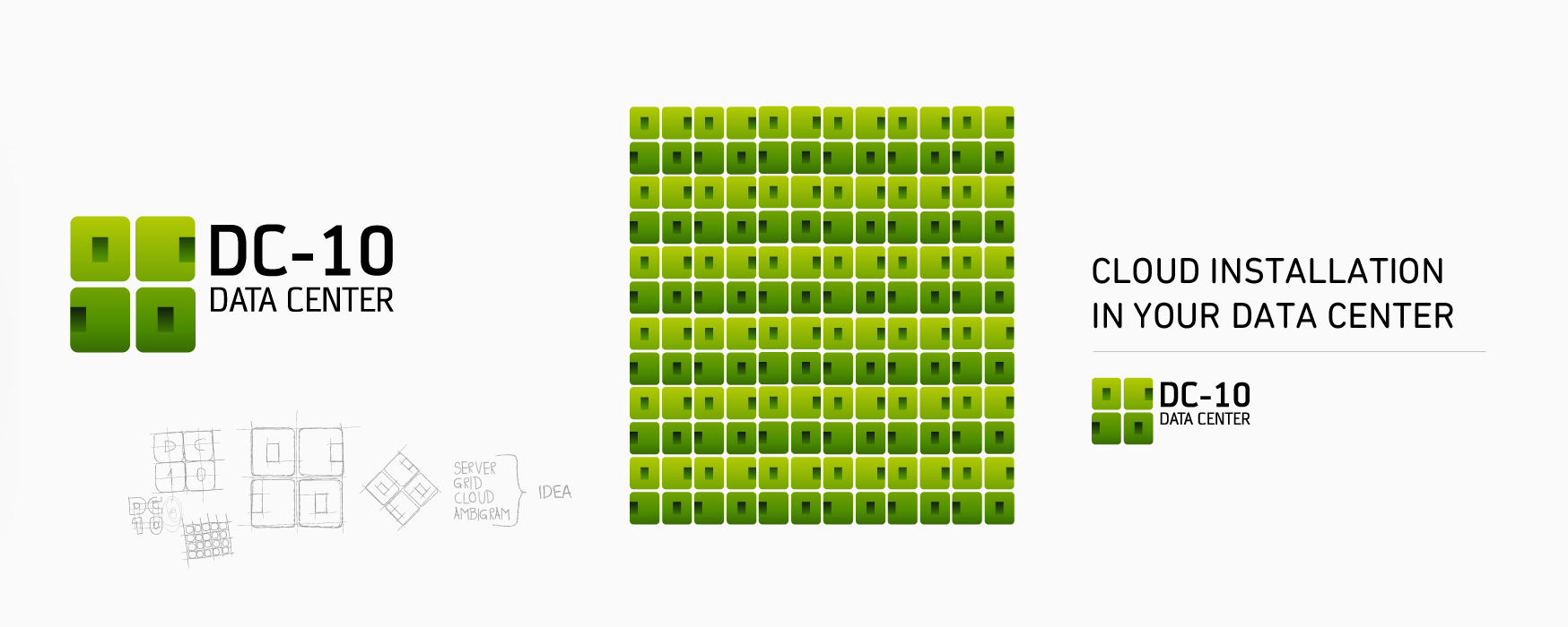
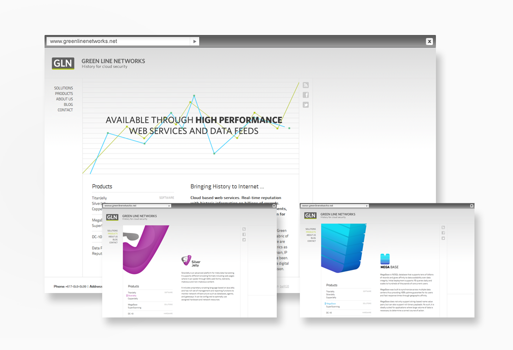
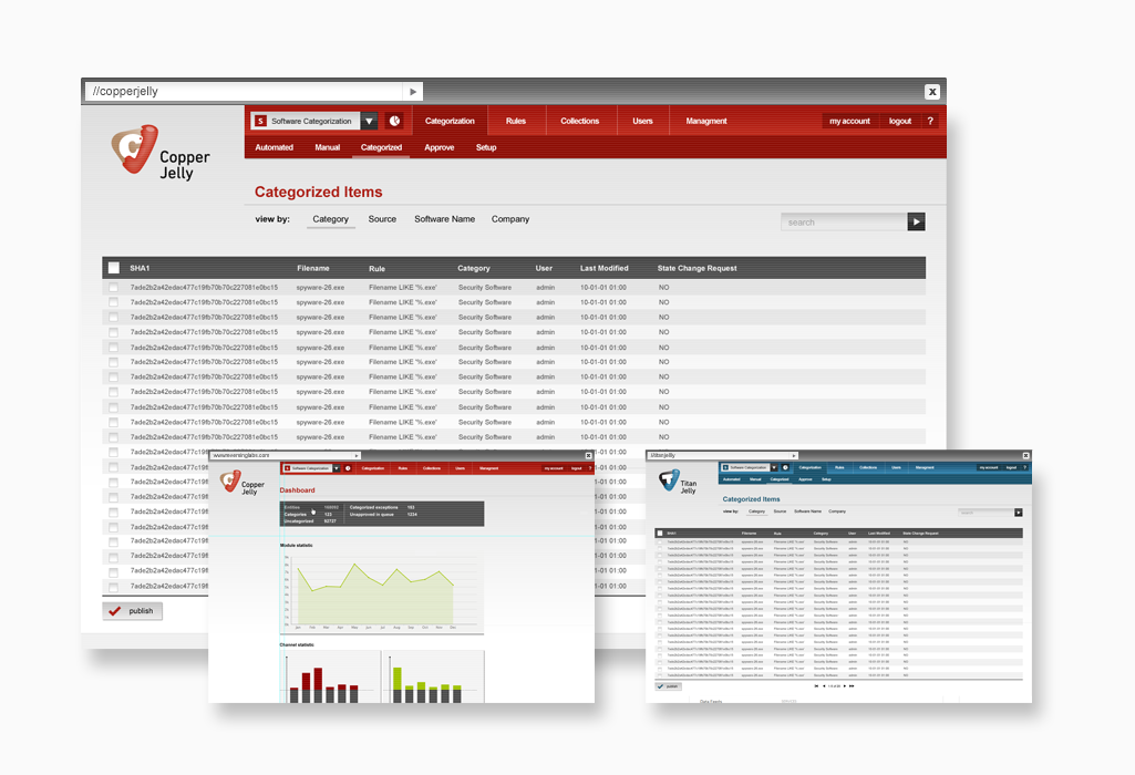
is a company that focuses on Internet data mining, analysis and storage, and as such creates the history of the Internet and makes it a safer place through a wide array of products and solutions. Our task was to create a visual identity for all 8 products divided into independent categories and have been designed to be visually different for better brand differentiation. Besides this, we have also created a web site and have also done work on some of the programs' interface.
SS and MB visual identity
Jellies visual identity

DC-10 visual identity
RS and DF visual identity

Website Visit
Copper and Titan jelly app interface
Wide View
Wide View
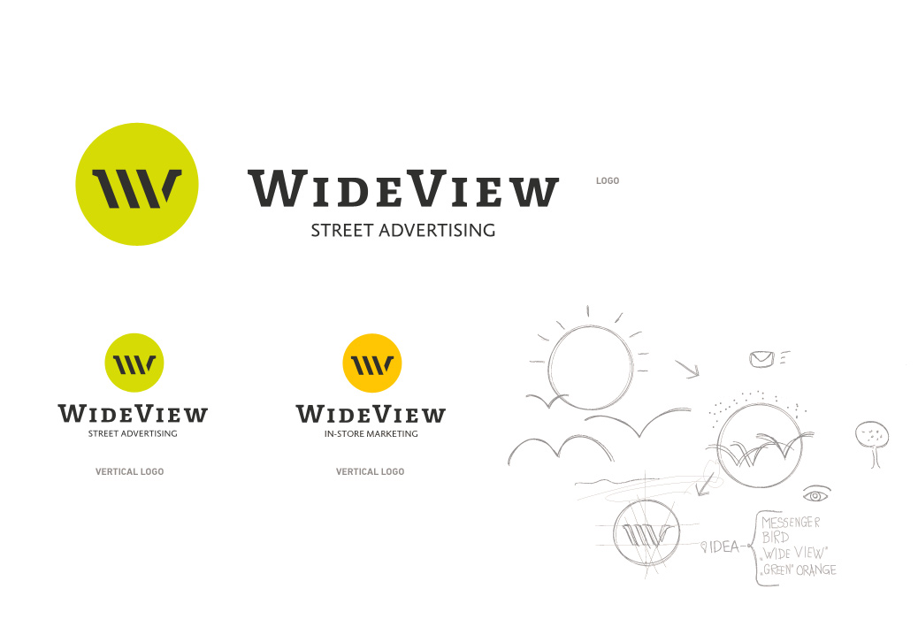
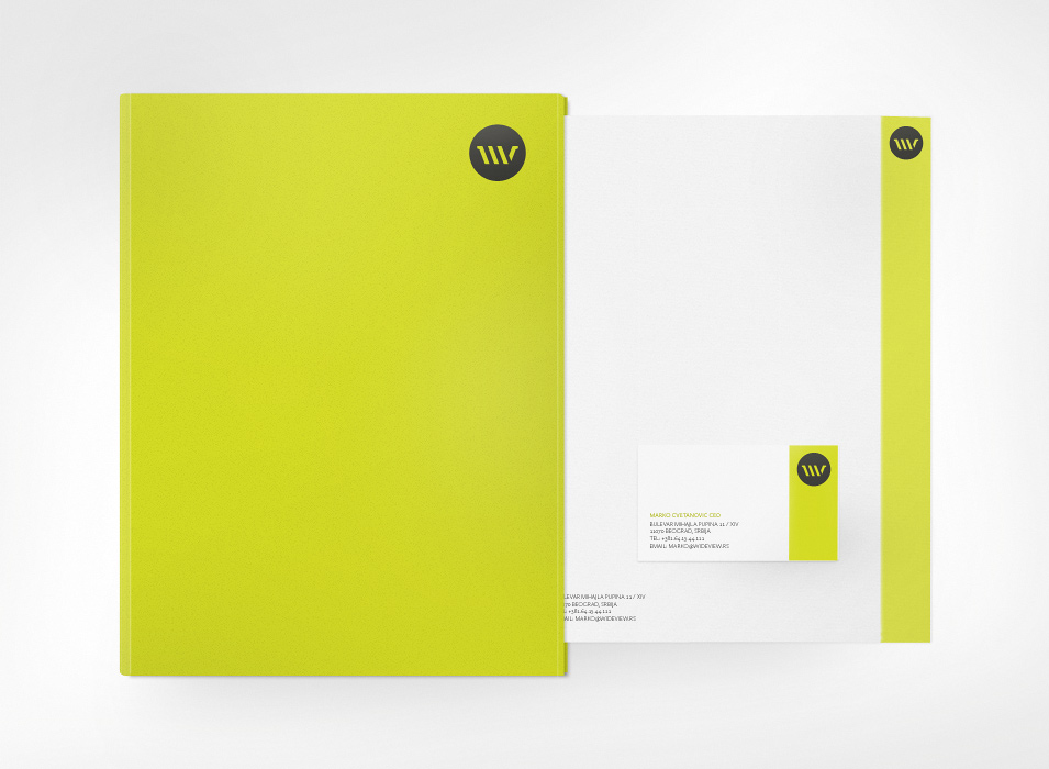
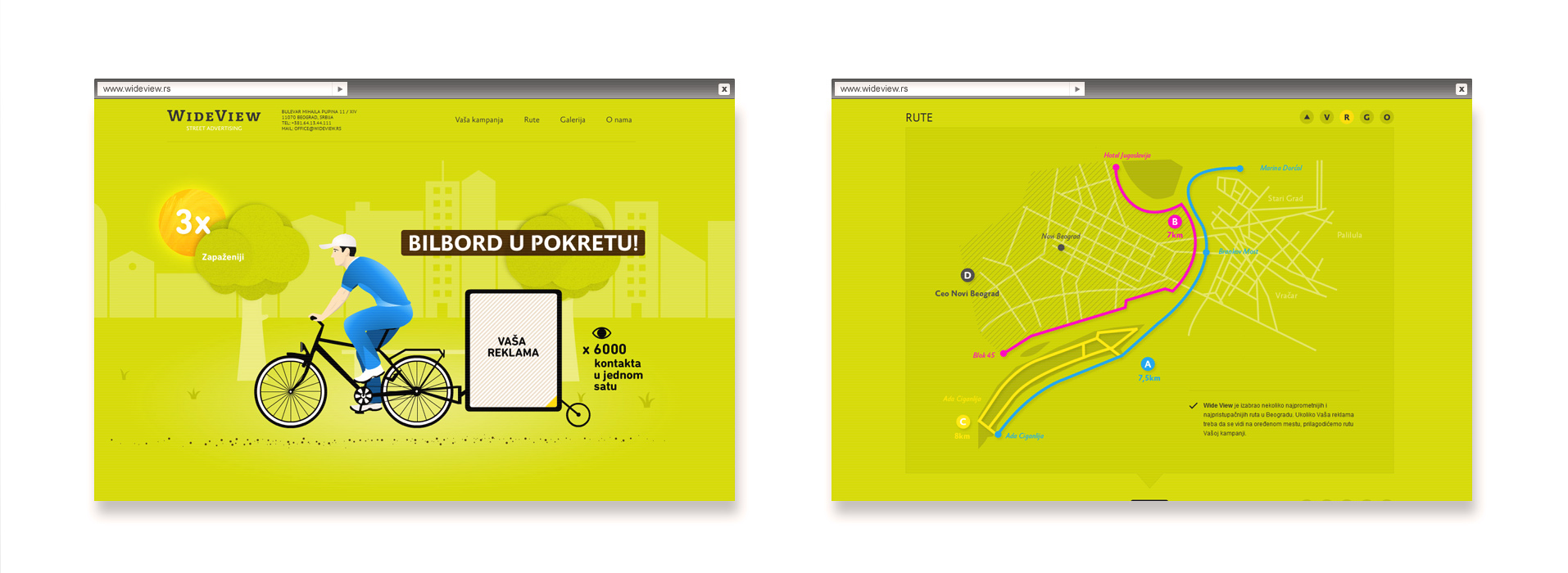
Wide View is a pioneer in the sphere of street advertising in Serbia initially founded by a young and creative team that wanted to bring innovation to the Serbian advertising scene. They were the first ones to introduce "bike advertising" in Serbia and in the meantime have further expanded their activities onto in-store marketing. Our task consisted of creating a complete visual identity for them which reflected the very essence of their multidisciplinary field of work. This was graphically demonstrated through a simple yet interesting one page website that explains the advantages of street advertising while simultaneously creatively implementing the power of HTML, CSS and scrolling.
Logo
Stationery
Website Visit
Opacic
Opacic
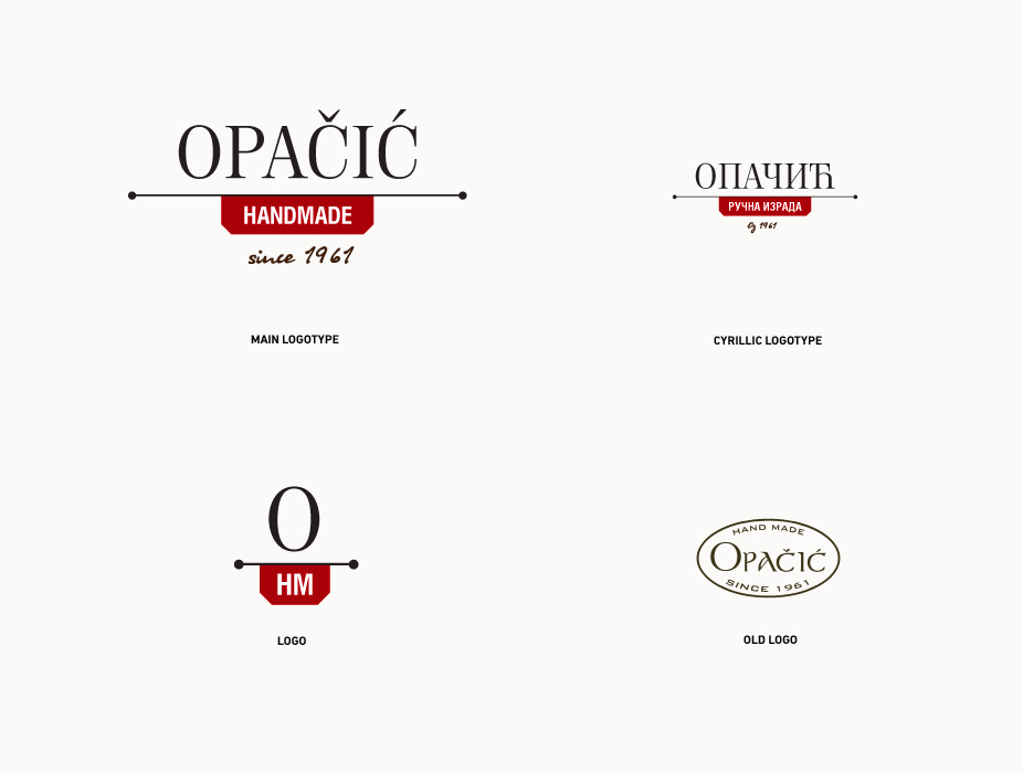
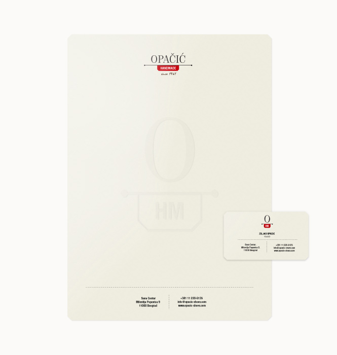
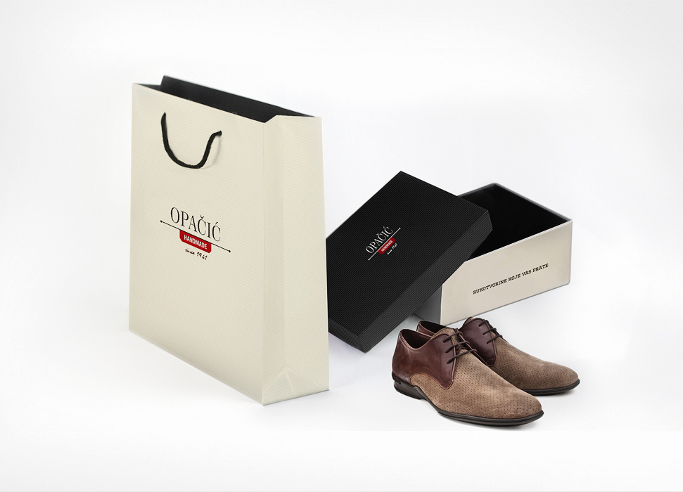
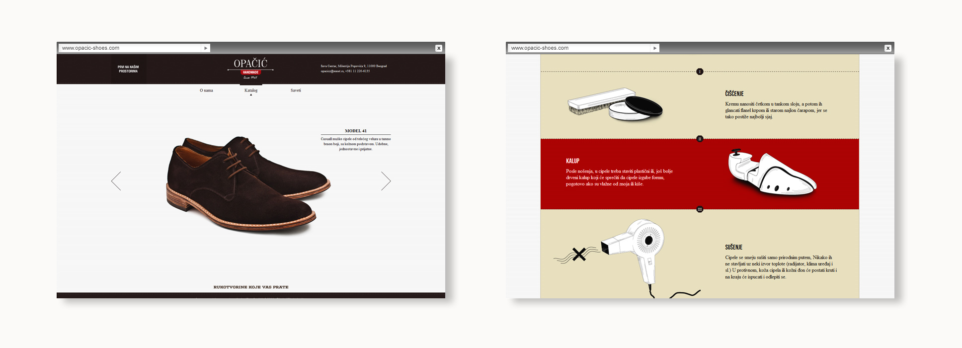
Opacic Hand Made is one of the few remaining traditional handicraft businesses in Belgrade that prides itself on a 50 year-long tradition of shoemaking. For this project, were were entrusted with the task to redesign the logo and create a new and contemporary visual identity that would through the usage of typography "Neopanta" refresh the company’s image while retaining the original spirit of tradition. In addition to rebranding, a new website was launched for which special illustrations were made. The website/catalog was developed without the usage of Flash and has been simplified in order to maximize focus on the product itself - the shoes.
Logotype
Stationery
Bag and shoe box
Website Visit
Hello Nature
Hello Nature
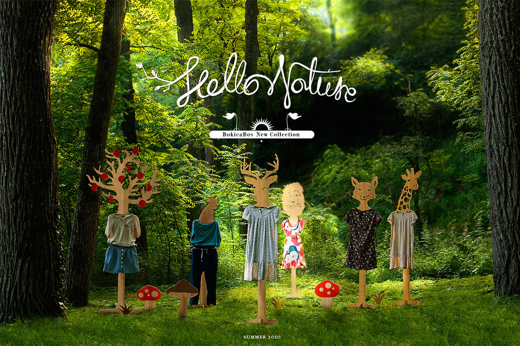
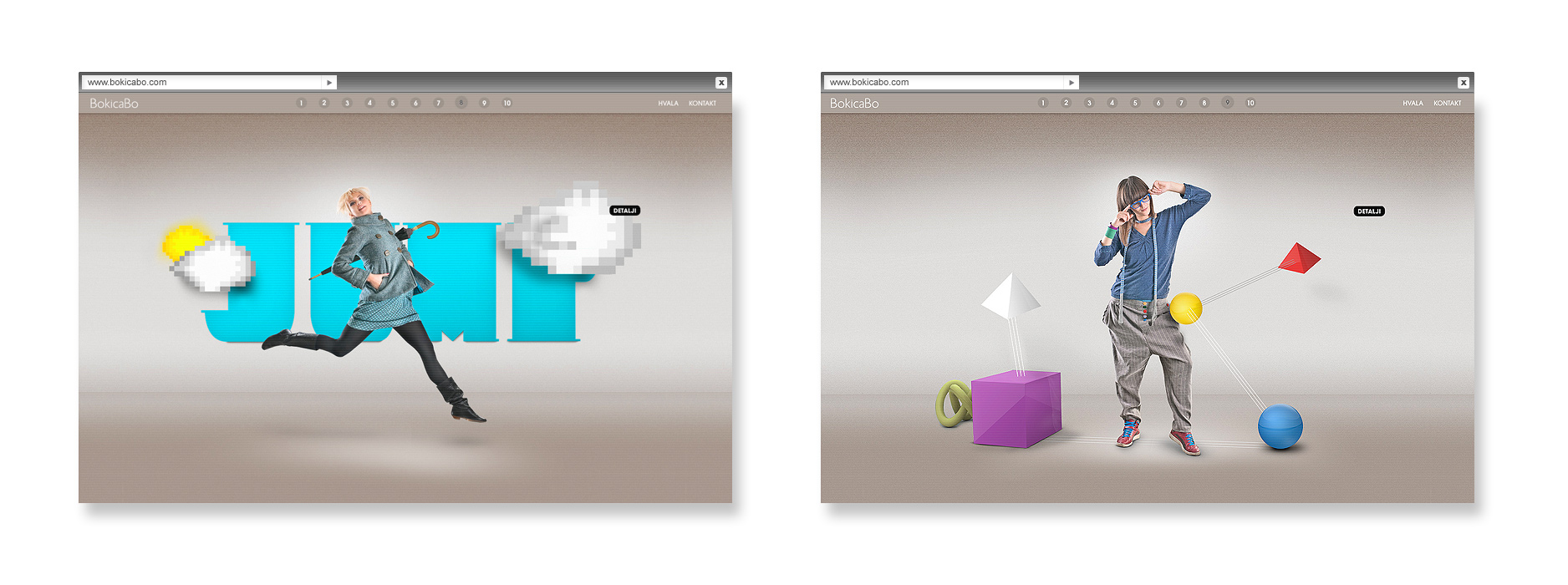
BokicaBo’s second collection which represents the beauty of nature through a retro yet contemporary way. We wanted to return fashion to its roots and in such a way remind visitors about the beauty and simplicity of nature which served as inspiration for the collection. The website is also experimental in many ways. It was built without the use of Flash, and the main idea was to convey information in the simplest form without too much unnecessary clicking. This site found itself on numerous websites devoted to web design.
BokicaBo campaign identity
Website Visit

Reversing Labs
Reversing Labs
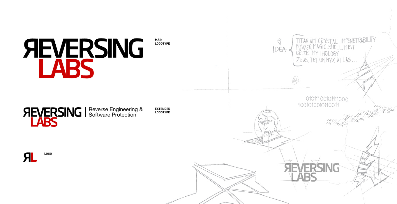
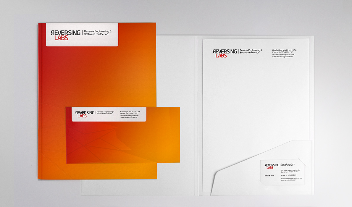
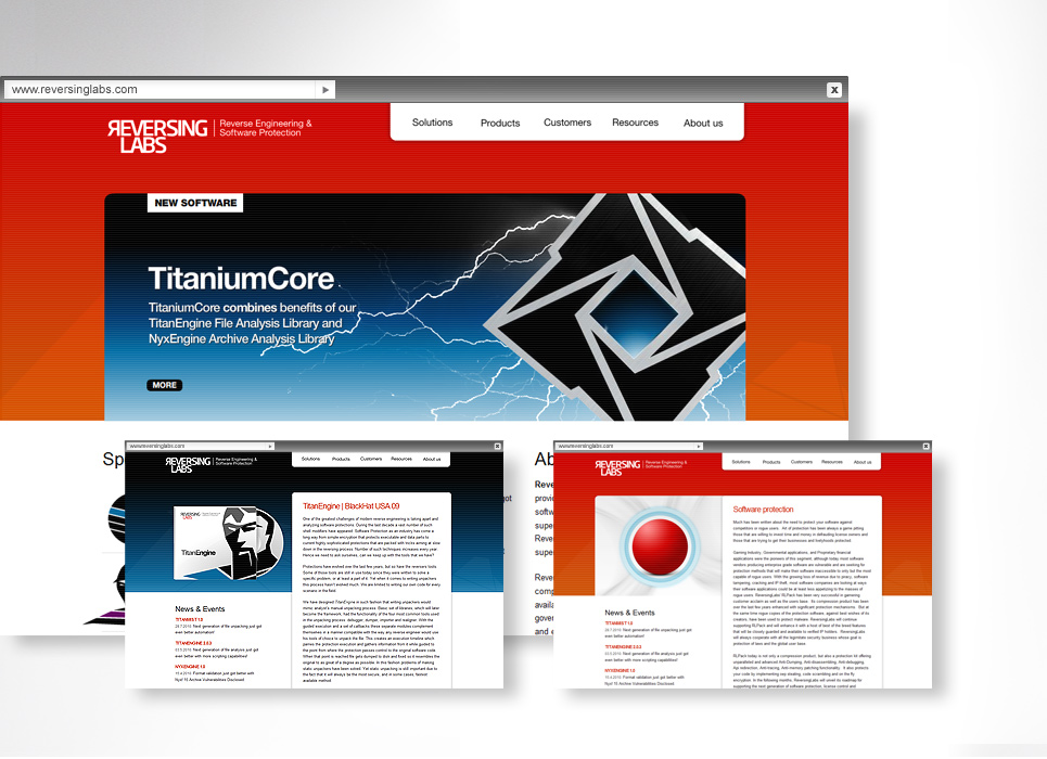
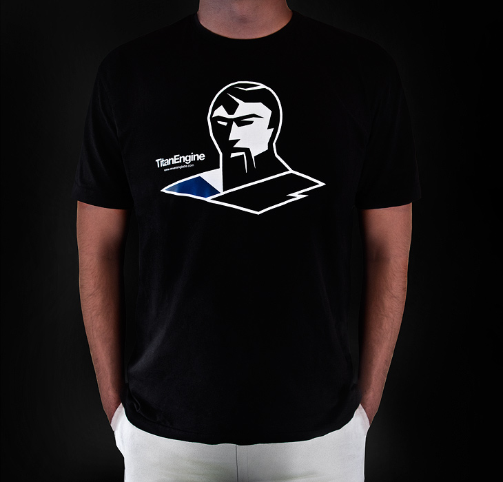
Has been founded with the goal to provide the best file analysis and software protection tools. They enable the security industry, governments and research institutions to rapidly and effectively reduce the spread of malware. With their software, our computers and data are safer. For many conventional users, their work is considered to be "miraculous", hence we have chosen to base their symbolism on Greek mythology. We have therefore chosen to base the visual identity around mythological figures which would metaphorically represent the software’s power, strength, resistance and invulnerability.
Logotype
Stationery
Website Visit
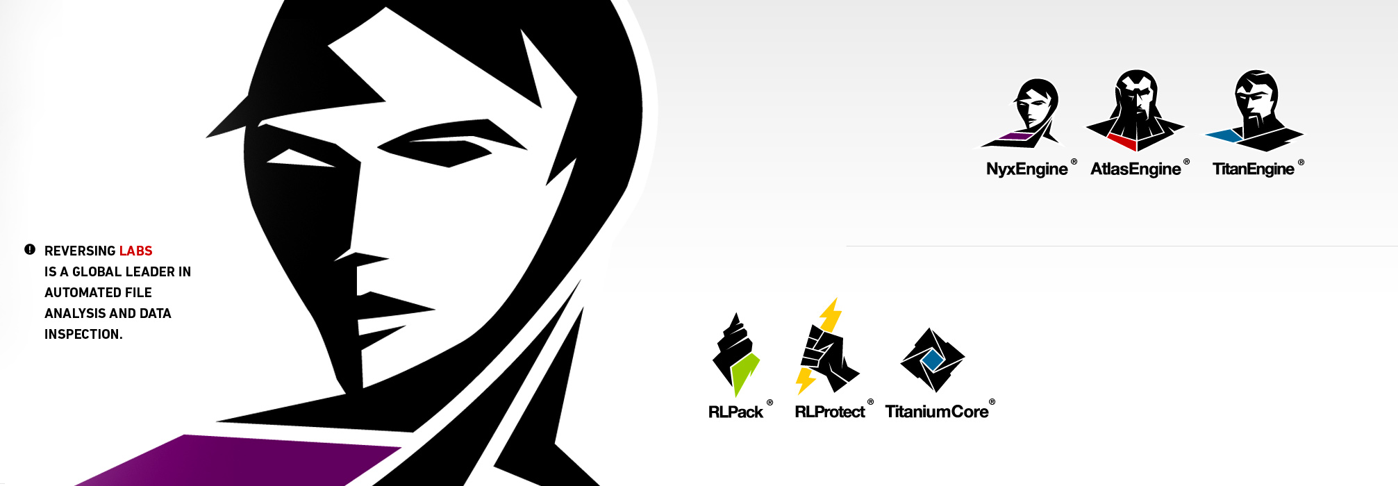
Products logos
RL products
The first group of products that contain "engine" in the name are software modules, ie - antivirus software. We have therefore chosen to base the visual identity around mythological figures which would metaphorically represent the software’s power, strength, resistance and invulnerability.
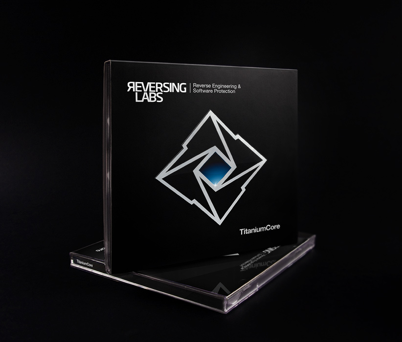
The second group of products consists of independent program packs such as: RLProtect and RLPack who function against software cracking, IP theft and software tampring. The RLPack is illustrated through Triton’s conch shell symbolyzing security. RLProtect is rendered by a lightning bolt held by the hand of Zeus, the king of the gods. Titanium Core and its shape is meant to represent a core protected by titanium on the outside.
CD pack
T-shirt
Kreata
Kreata
A young and ambitious team of architects from Belgrade wanted to present their work to both the local and international audience in an appealing and efficient, especially emphasizing on the completion of their latest project - the Zepter hotel. The client wanted a simple and bilingual elegant solution that was provided through a specially adapted CMS customized for their needs. The project was completed in a very short time period, while the collaboration with the team was great due the excellent dynamics and mutual understanding. Illustration by Bogdan Maksimovic
Website Visit

BokicaBo
BokicaBo
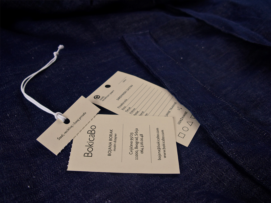
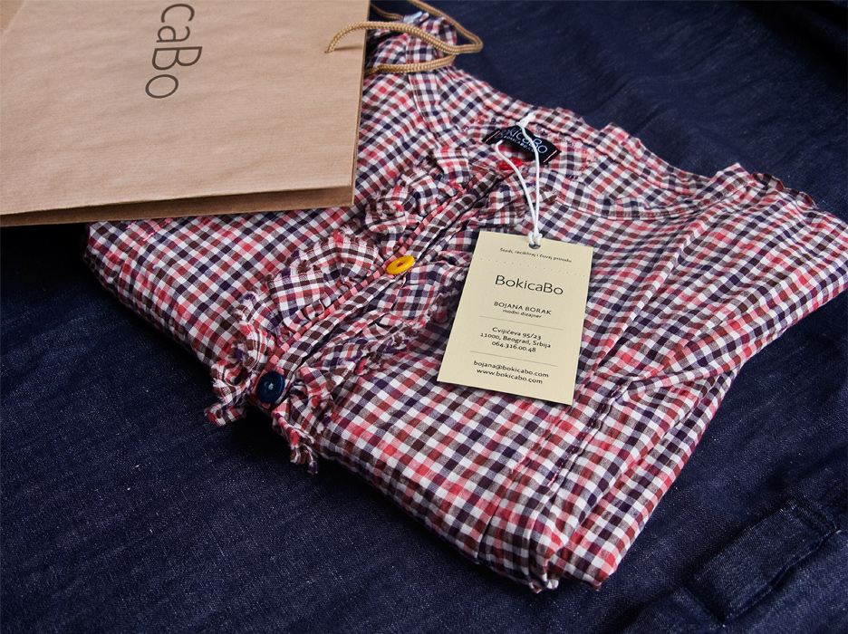
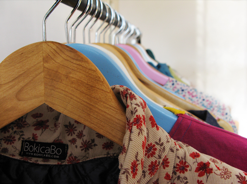
BokicaBo is a small Serbian fashion brand. It was intially launched in late 2009 by Bojana Borak and myself after an extended period of mutual collaboration. Along with a group of friends, we decided to team up and create a place that would focus on creativity. It could also be said that this brand as such is the embodiment of simplicity and the classical. The main idea was to draw attention to fashion by using the web as a medium of promotion rather than relying on conventional and expensive ways of advertisement. Our goal was to use environmentally friendly methods of productions by using recycled paper and little paint, leaving color for the clothes and the web. The site won several awards and was mentioned on numerous websites due to the specific visual approach we have taken and the technology used in its creation.
Business card / Label
Bag, dress and label
Clothing line
Website Visit
Kotarling
Kotarling
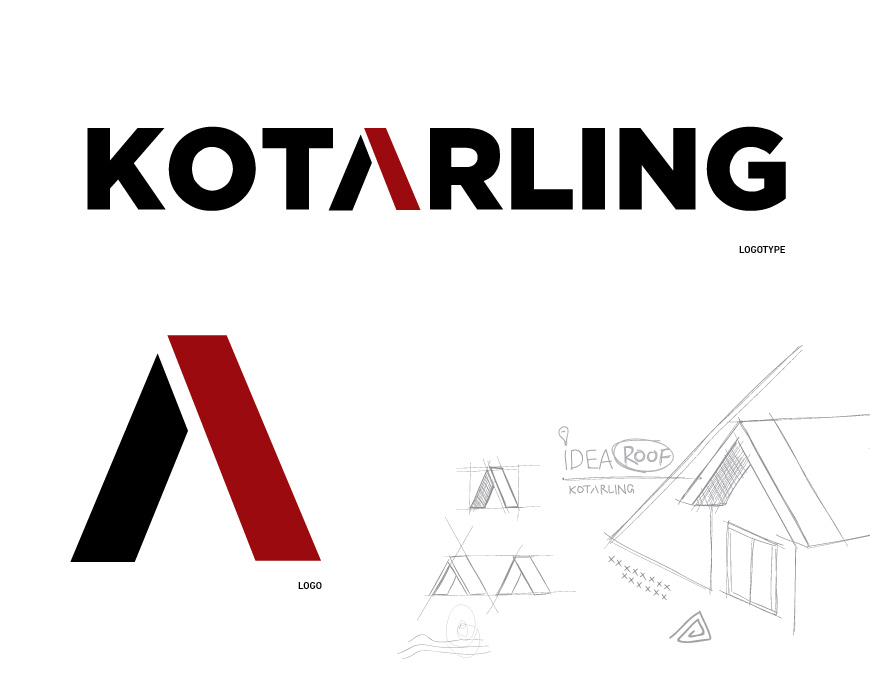
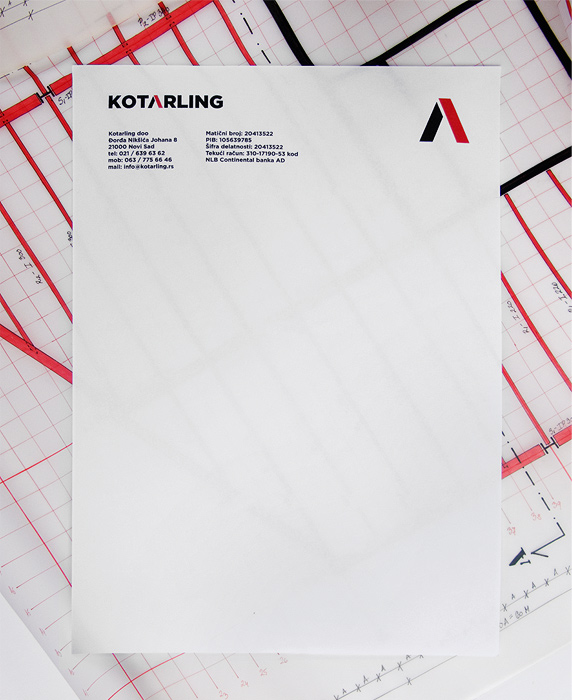
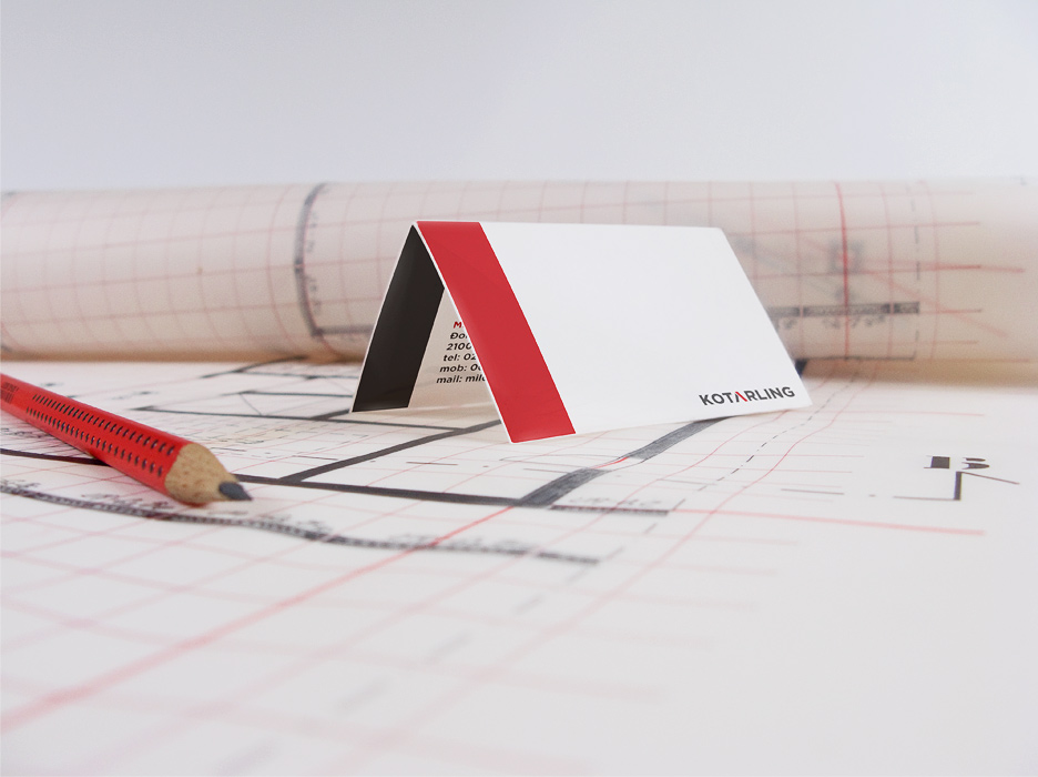
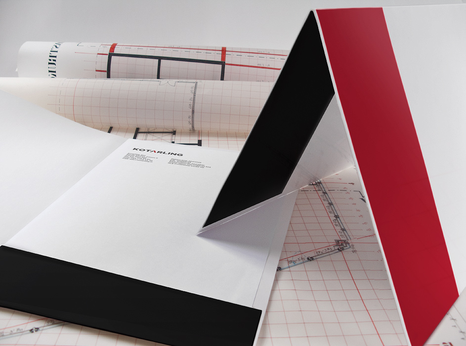
Kotarling is a local construction company focusing predominantly on engineering, project management and construction works. This young and dynamic company needed a new logo and visual identity to best demonstrate its field of activity in a symbolic way. The main idea behind the logo focuses around the letter "A" which in this case represents the roof of a house. The logo further served as an inspiration for file folders, business cards and other stationary which when opened and placed on a flat surface symbolically forms the roof of a house.
Logo
Letterhead
Business card
Folder
KBC Bank
KBC Bank
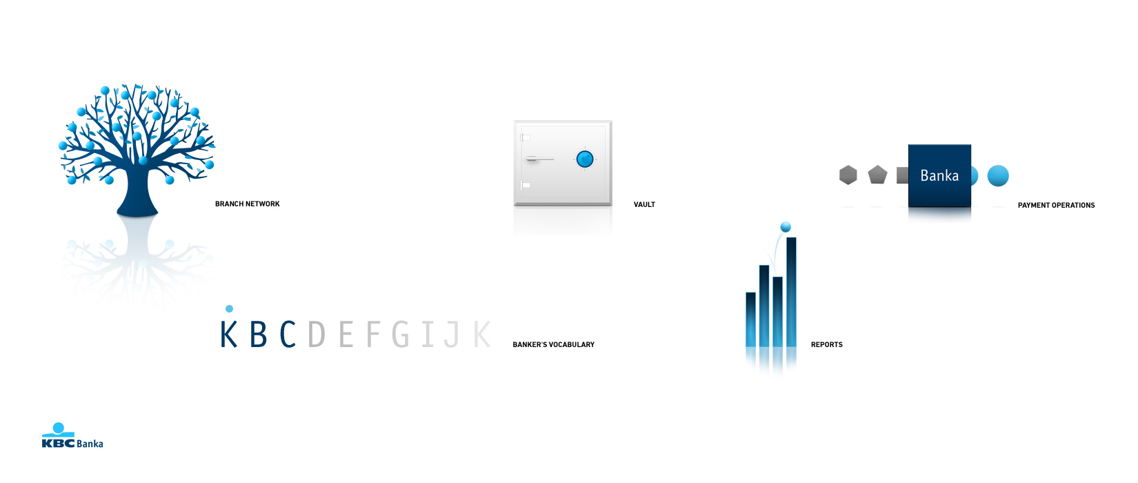
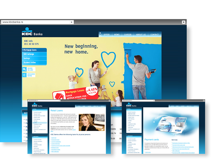
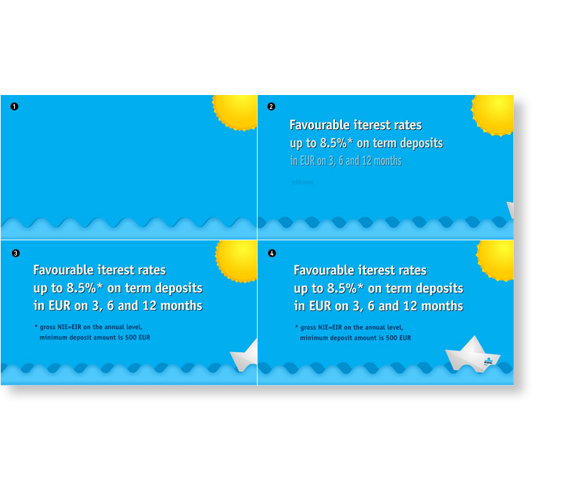
"KBC Banka" is a member of the Belgian KBC Group, the leading financial group in Europe. KBC Group is present on more than 35 markets worldwide with over 57,000 employees and approximately 12 million clients. Our task consisted of designing the website interface as well as the accompanying graphic elements and illustrations. We have stirred things up by changing the way of communicating with the audience by picking navy blue to be the dominant background color, bringing great feedback. Throughout the site’s regular maintenance, some great illustrations occurred as well which you can see in the portfolio. Project done at Coba&Associates.
Website illustration
Website Visit
Summer savings animation
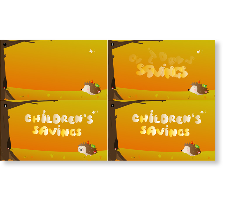
Autumn children's savings annimation
Serbian Government - Ministry for Diaspora
Serbian Government - Ministry for Diaspora
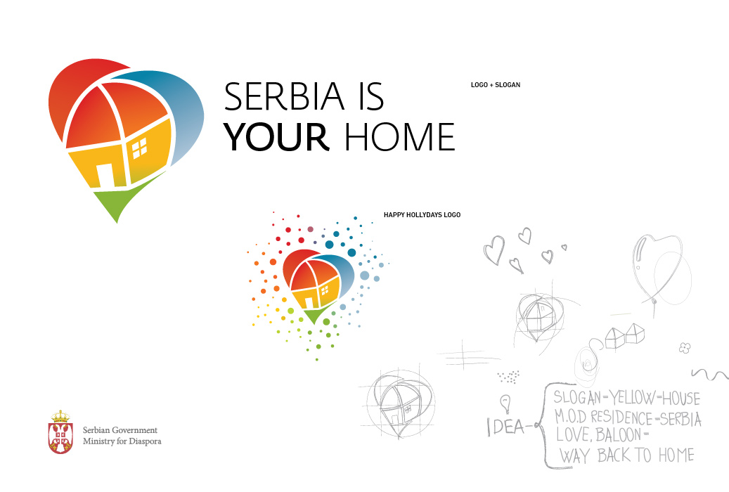
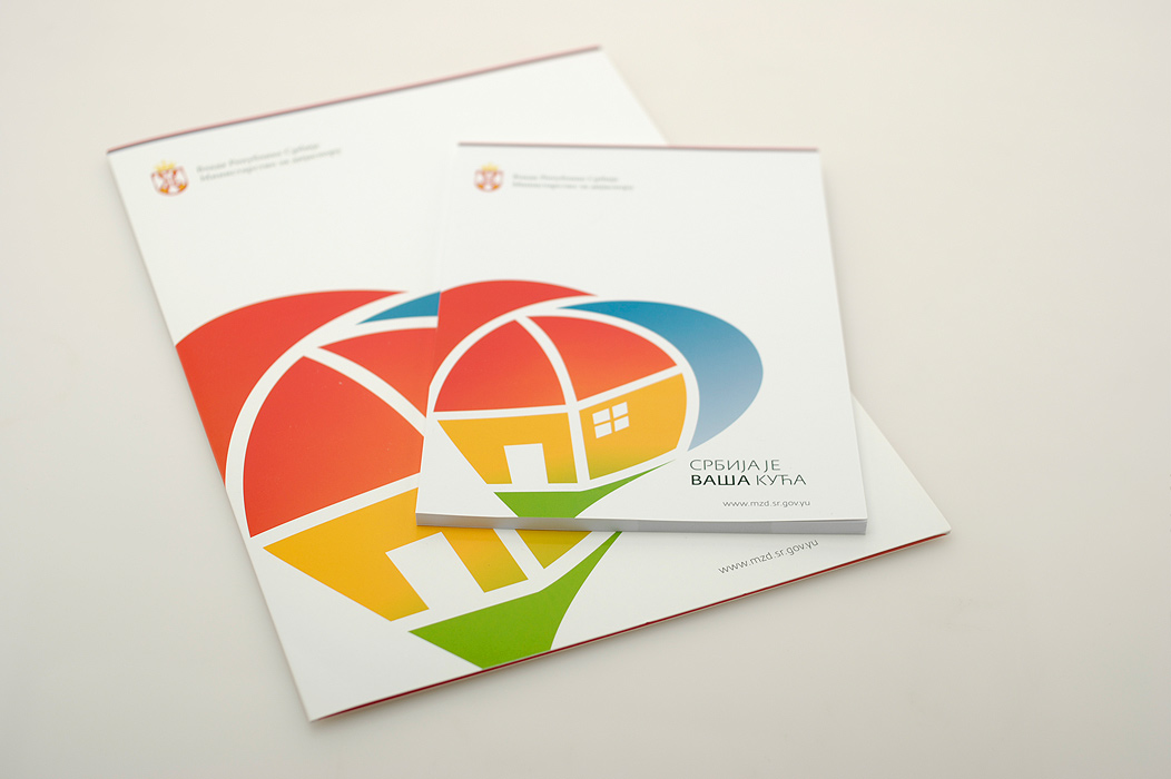
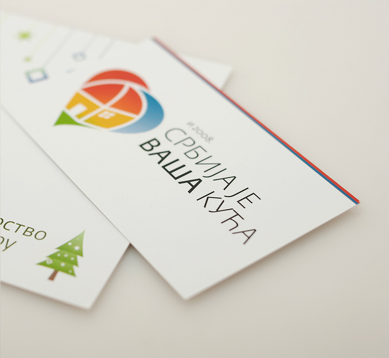
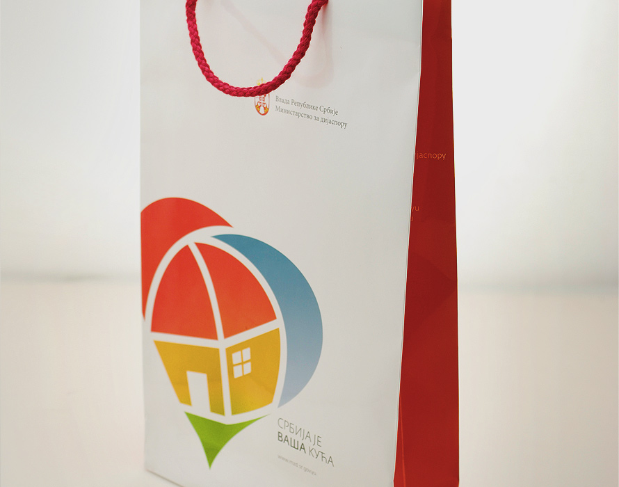
The Serbian Ministry for Diaspora needed a specific visual identity that would allow for a better and more intimate communication with the Serbian diaspora abroad. The main idea focused around the yellow building of the ministry (located in Vase Carapica street in Belgrade) symbolically acting as a liaison between Serbia and its diaspora. The logo as such therefore specifically distinguishes the Ministry for Diaspora from the others, giving it a specific visual identity. The logo was well accepted by the public, both in Serbia and abroad, and has remained in use despite the change of government. Project done at Coba&Associates.
Logo
Stationery
Calendar
Bag
Avon
Avon
This project was the product of an excellent cooperation with the local branch of the world renowned cosmetics brand "Avon". With 43 campaigns over a two year period, we have managed to give the old website a new and refreshing appearance which included numerous custom-designed animations. The main task consisted of modifying campaign appearance using Avon’s powerful and global CMS. Currently the website is showcasing a new version of the CMS, and you can see some of the old "looks" on the screenshots.
Website Visit

Animation
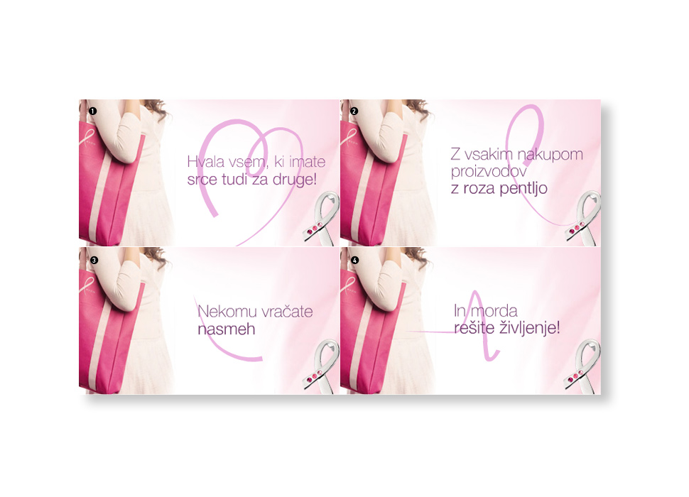
- Thank you everyone for your love.
- By buying products with pink ribbon
- You bring someone's smile back
- And maybe saving someone's life.
